Touch
With Touch, a display becomes a touchable kiosk: visitors tap tiles and browse through topics, offers, or locations themselves. You put the experience together in a dedicated design program — no programming required — and send it to the display with a single click.
This guide takes you from installation through the first instance to the finished experience on the display — covering every field and switch you'll encounter along the way. The pink highlight on the images shows you where to click.
How Touch works
Touch consists of two parts that work together:
- The TOUCH Studio (
touch.revolutionscreen.net) — this is where you build the experience: create pages, place tiles, add links, and try it out. - The "Touch" app on the display — it shows the finished experience in full screen and responds to touches.
The display URL connects both parts. You set it once per display; after that, the Veröffentlichen (Publish) button in the Studio is all you need, and the display fetches the new version on its own.
An instance is a specific deployment of an app on a screen. For Touch, that means one instance per display. The experience itself — your project — lives in the Studio and can run on multiple displays at the same time.
Prerequisites
- An active revolutionSCREEN subscription with at least one display
- A touch-sensitive display (touch panel) — or a display with a USB motion sensor, see note below
- Access to
my.rstv.appto install the app and assign it to the screen - A Dashboard key for the TOUCH Studio (you'll get this from us)
Without touch, Touch still works as a shop window display: the idle loop invites people to tap, and a USB motion sensor starts the experience as soon as someone stands in front of it. Tapping itself, however, does require a touch panel.
Step 1 · Installing the "Touch" app
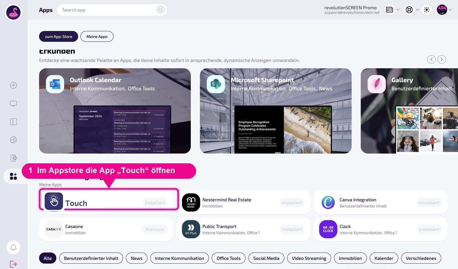
Sign in to my.rstv.app and open the Appstore. Search for the Touch app and click Installieren (Install). The app will then appear in your app overview.
Step 2 · Creating an instance and assigning it to the display
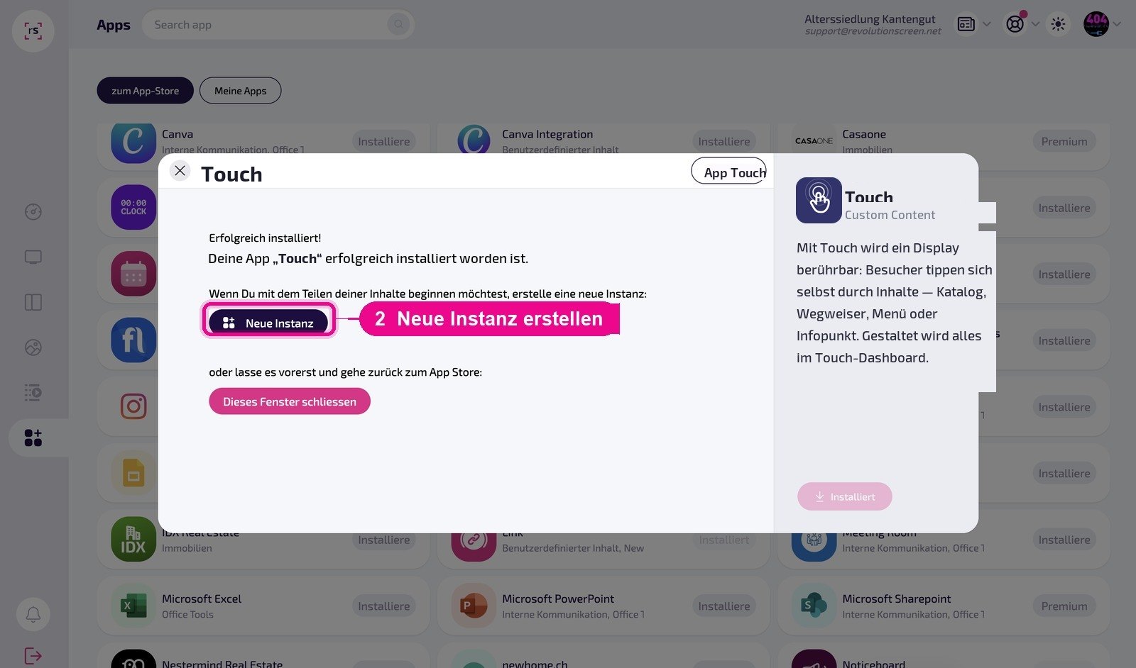
Open the installed app and create a deployment using Neue Instanz (New instance). Give it a name you'll recognize — for example, the display's location (Reception Stans, Shop Window Länderpark).
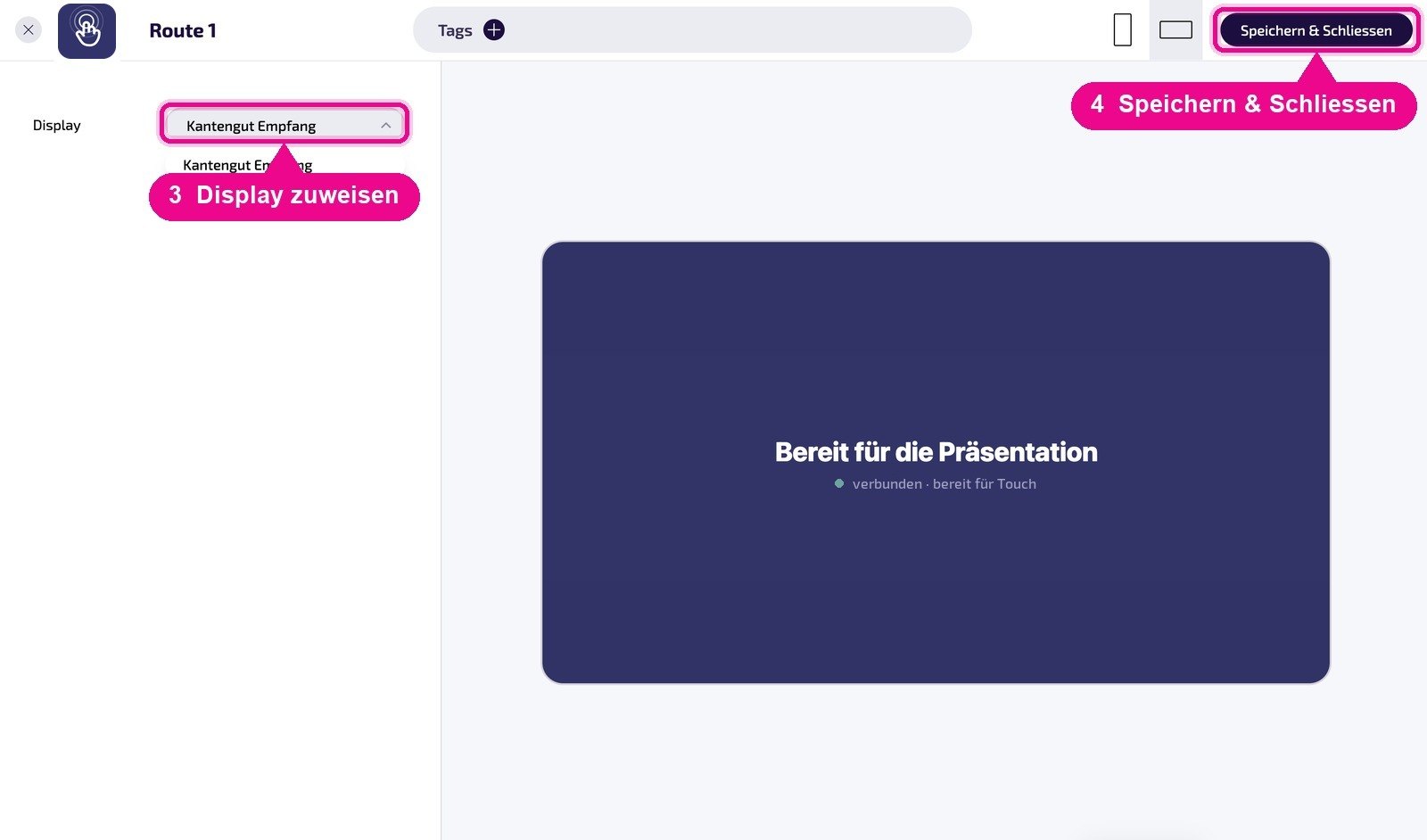
In the instance, enter the display URL from the Studio — it's generated in Step 5, when you publish for the first time. Then assign the instance to the desired Screen and save.
You can also create the instance only after your experience is finished. It's often practical to first build and publish a project in the Studio, then copy the URL and paste it here — this way you only need to switch between the two windows once.
Step 3 · Signing in to the TOUCH Studio
You open the Studio at touch.revolutionscreen.net. Enter the Dashboard key and click Anmelden (Sign in). The key stays saved in your browser — next time, you'll land directly in the project overview.
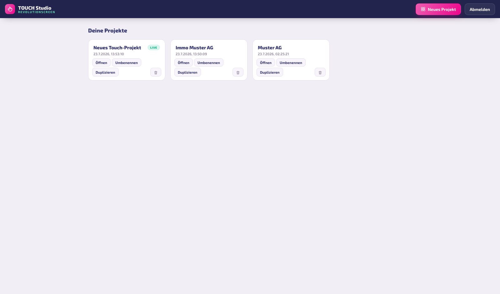
In the overview, you can Öffnen (Open), Umbenennen (Rename), Duplizieren (Duplicate), and Löschen (Delete) each project. If a project is already published, its tile shows the live label.
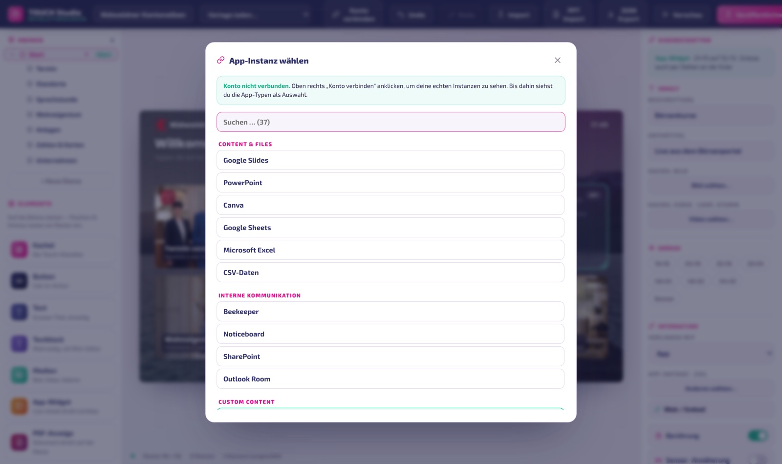
At the top of the bar, you'll find Konto verbinden (Connect account). If you sign in there with your my.rstv.app credentials, you'll see your actual apps, playlists, layouts, and media when linking, instead of generic placeholders. Uploaded images and videos will also end up in your media library instead of within the project itself. If you manage multiple companies, select the right one after signing in.
Step 4 · Creating a project
With Neues Projekt (New project), you choose a template. There are ready-made concepts for Reception & Lobby, Sales & Real Estate, and Hospitality & Self-Service, plus company-specific templates and a blank project. A template is a starting point — everything in it can be changed.
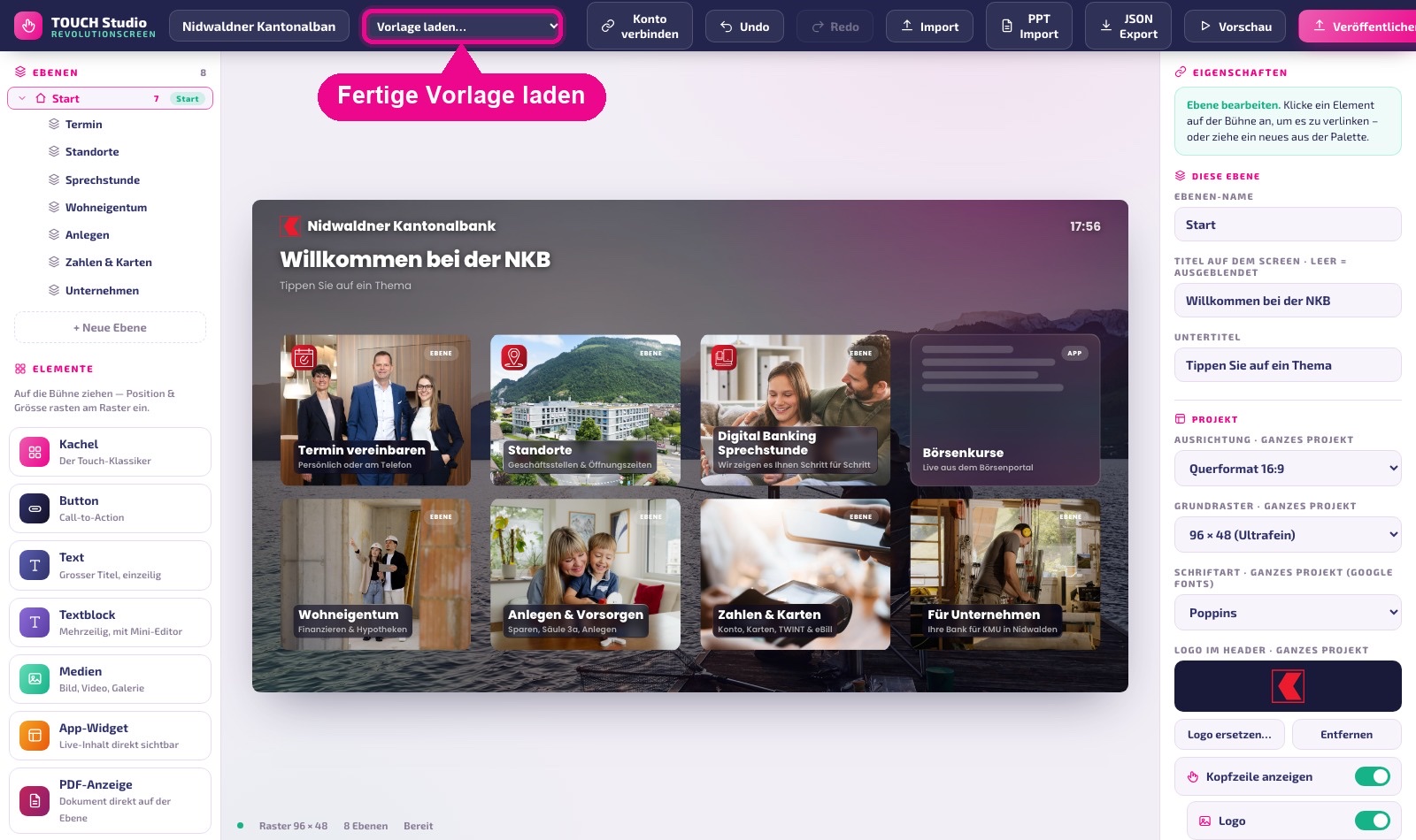
"Vorlage laden…" (Load template…) replaces the entire project. If you just want to try something out, first create a copy using Duplizieren (Duplicate).
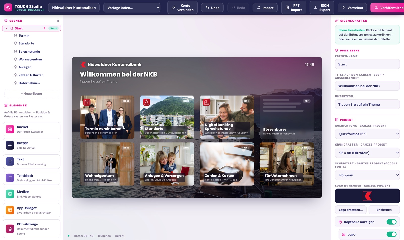
Overview of the interface
The Studio is divided into three columns. This layout always stays the same:
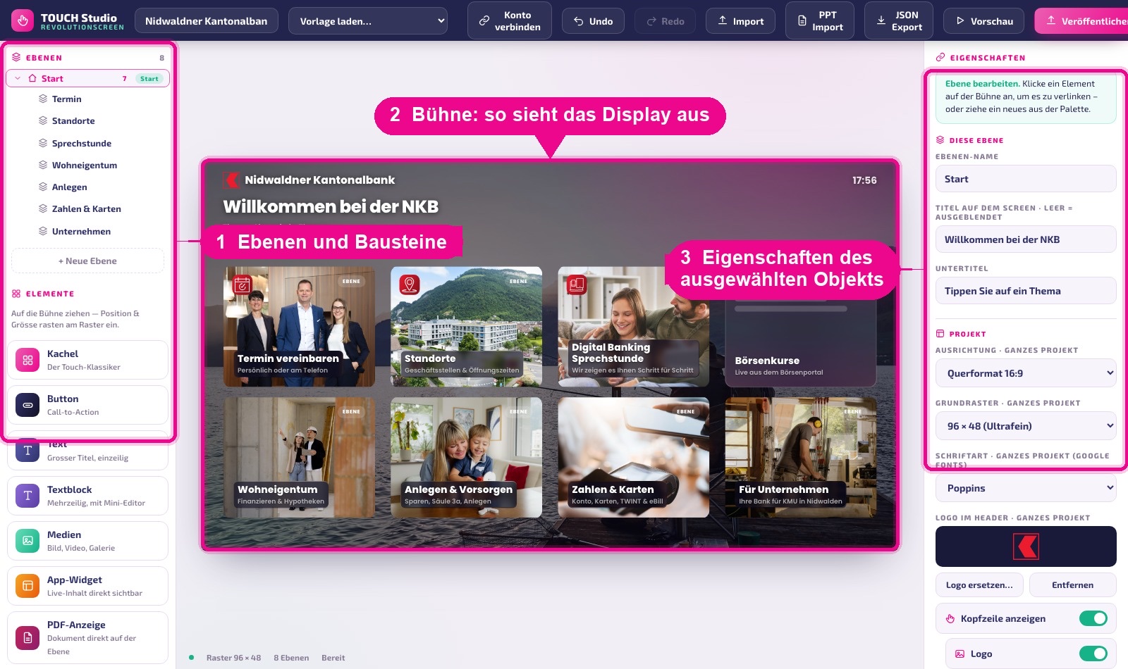
- On the left, at the top, are the layers (the pages of your experience), and below them the building blocks you drag onto the stage.
- In the middle is the stage — it shows to scale what will later appear on the display, including header and title.
- On the right are the properties: if you've selected an element, its settings appear here; otherwise, you'll see the settings for the current layer and the whole project.
Below the stage, you'll see the active grid, the number of layers, and the save status. Your changes are saved automatically, about one second after you stop working.
Ctrl/Cmd + Z undoes, Ctrl/Cmd + Shift + Z redoes, Delete removes the selection. Moving with arrow keys or copying via keyboard is deliberately left out — everything else you do with the mouse.
Layers: the pages of your experience
A layer is a page. The first layer is always the home layer — it carries the house icon and is shown on startup. You add further layers with + Neue Ebene (+ New Layer).
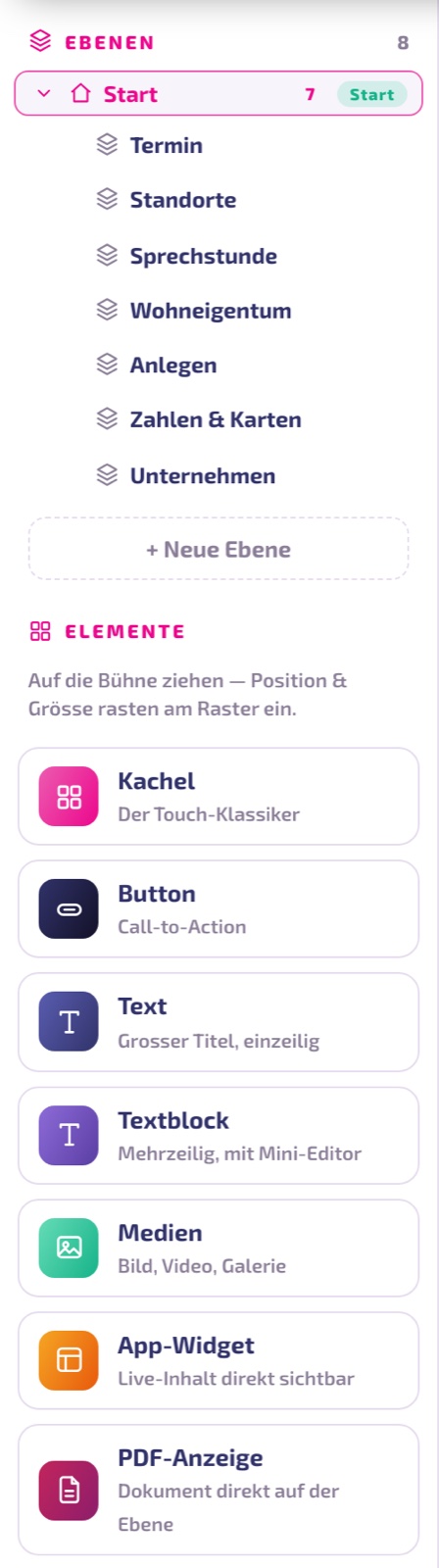
- Clicking opens the layer on the stage.
- Dragging rearranges: dropping a layer onto the middle of another turns it into a sublayer; the top or bottom third moves it before or after.
- Trash icon deletes it. Child layers are kept and move up one level.
- Renaming doesn't happen here, but on the right in the Ebenen-Name (layer name) field.
The tree structure helps you keep an overview. Where a visitor jumps to is determined exclusively by you through the linking of elements — not by the order in the tree.
Blocks: what you can drag onto the stage
You drag all blocks from the left column onto the stage; they snap to the grid. Eight types are available:
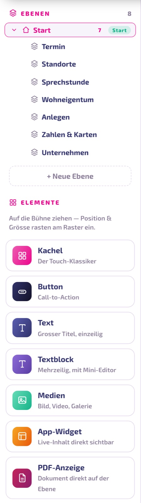
- Tile — the touch classic: a large surface with caption, subtitle, icon, and optionally an image or a silent looping video. This is what you use to build the main navigation.
- Button — a narrow button for a single action ("Book appointment"). Has no subtitle.
- Text — a single-line heading. Never tappable.
- Text block — multi-line body text with font size, alignment, bold, and an optional glass panel.
- Media — image or video area.
- App widget — shows the content of an app directly on the layer, such as weather, timetable, or menu board.
- PDF display — displays a document directly, without anyone needing to tap.
- Table — price list or opening hours, with cell borders like in a spreadsheet.
App widgets and PDF displays show a sample representation in the Studio and in the preview. The actual content is only delivered by the revolutionSCREEN Player on the display. Notice windows and videos, on the other hand, already work fully in the preview.
Configuring an element — field by field
Click an element on the stage. Its settings appear on the right, with the type, size, and position always shown at the top — for example "Kachel · 4×3 auf 0/2" (Tile · 4×3 at 0/2).
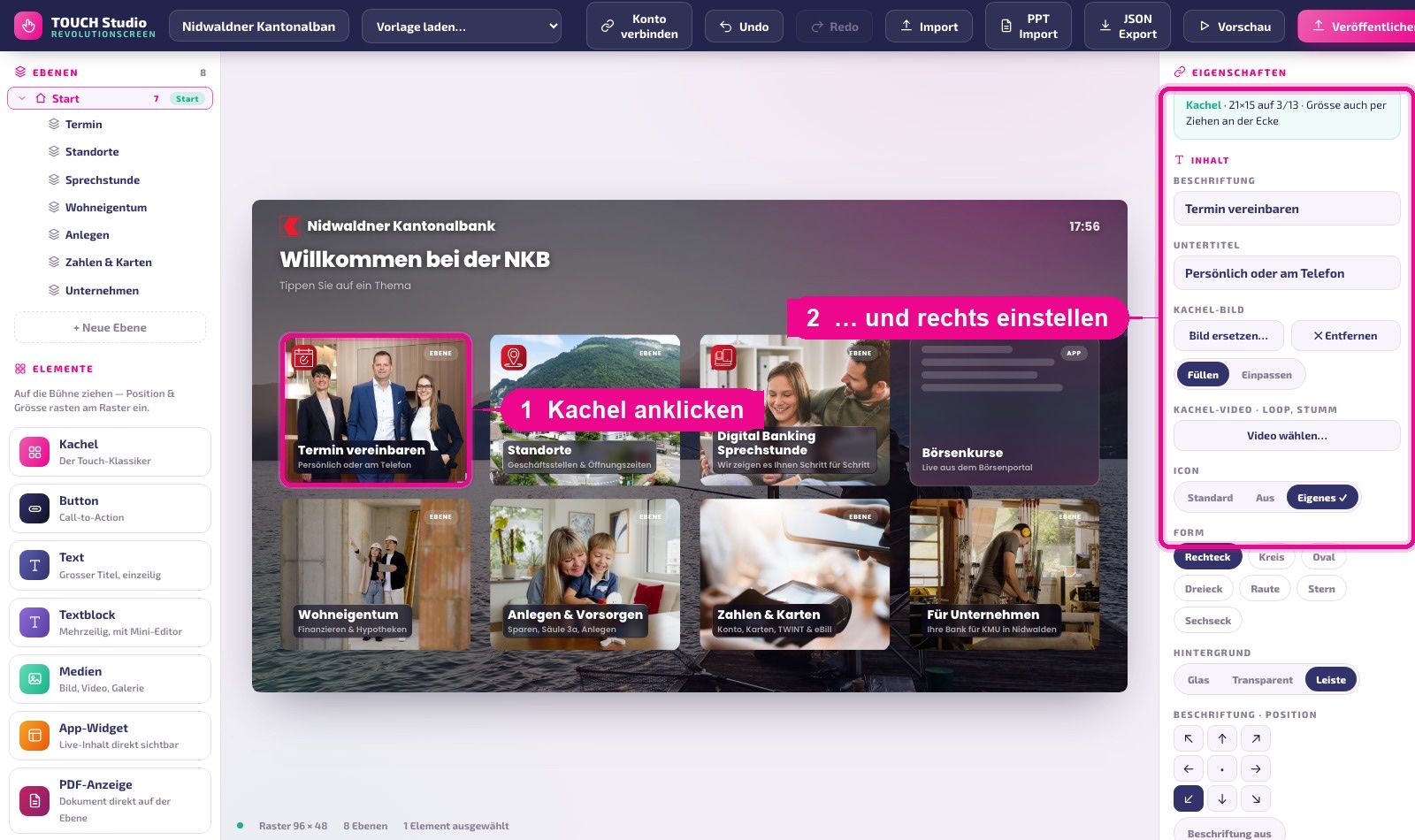
Content
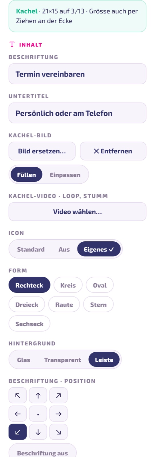
- Caption — the title on the element.
- Subtitle — the small line below it (tile, media, widget, PDF).
- Tile image — image from the media library or from your computer. Fill crops the image, Fit shows it in full.
- Tile video — silent looping video behind the caption. Looks elegant, but costs performance; older displays automatically hide it.
- Icon — Standard (symbol of the type), Off, or Custom image. A custom icon is automatically downsized and embedded into the project.
- Shape — rectangle, circle, oval, triangle, diamond, star, or hexagon. With any shape other than rectangle, the icon field is omitted.
- Background — Glass (frosted surface), Transparent (image only), or Bar (narrow band only behind the text). For photo tiles, Bar is usually the best choice: the image stays unobstructed, the text stays legible.
- Caption position — nine positions from top left to bottom right; the default is bottom left. Caption off hides the title and subtitle entirely.
Size
Eight quick sizes from 2×2 to Banner (full width, flat). For finer control, use the handle at the bottom right of the element.
Interaction: what happens when tapped
Under Verlinken mit (Link with), you determine where a tap leads:
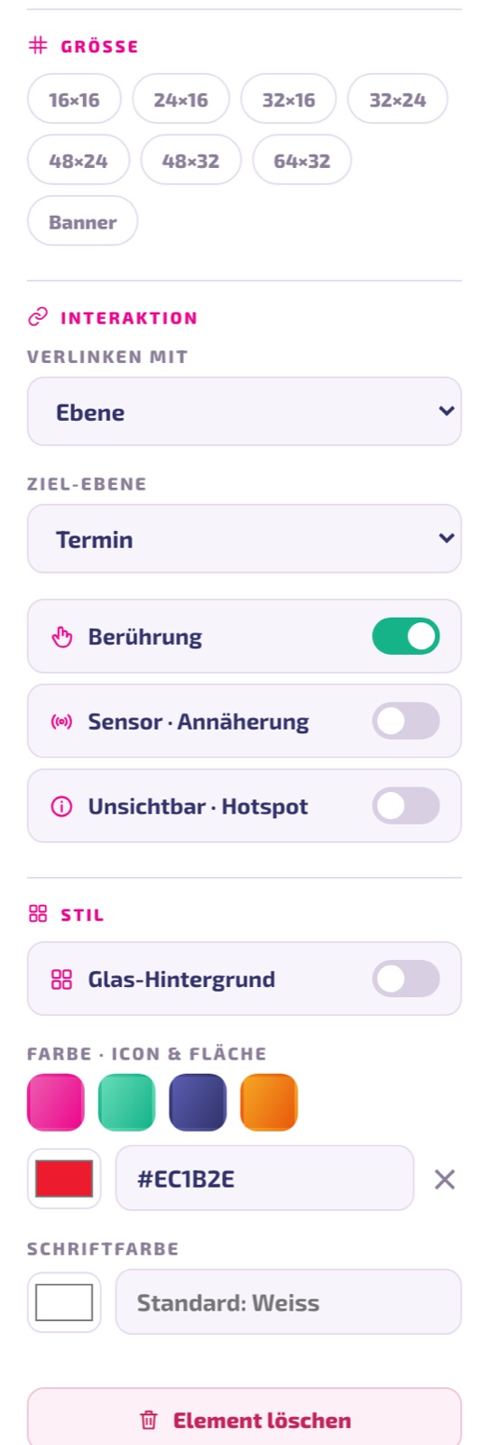
- Layer — jumps to another page of your experience. This is how navigation is created. In the Player, a Back button and a house icon then appear automatically.
- App — opens an app instance from your account, such as weather or timetable.
- Playlist — starts a Playlist.
- Layout — shows a Layout.
- Media — plays a video in fullscreen; clicking beside it closes it again.
- Website — opens a page in a kiosk frame.
- PDF — shows a document.
- Notice — displays a small window with a title and text. Ideal for opening hours, phone numbers, or an emergency notice — works without any additional app.
- None — the element is purely decorative.
In addition there are two toggles: Touch (on) makes the element tappable — turn it off and it won't react to anything. Invisible · Hotspot makes the element transparent but still tappable: perfect for making individual areas of a background image tappable.
Style
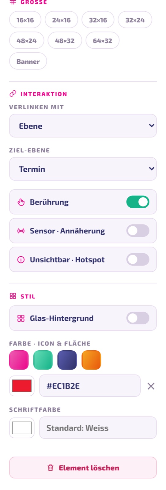
- Color · Icon & surface — four preset tones or a custom color as a hex code (
#RRGGBB). On a tile it colors the icon field, on a button it colors the entire surface. - Font color — empty means white.
- Delete element — removes the element (undo with Ctrl/Cmd + Z).
Configuring the layer
If you click on an empty area of the stage, the right column shows the layer settings.
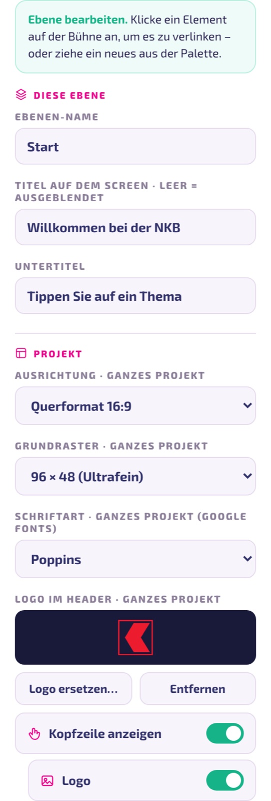
- Ebenen-Name (Layer name) — for you only, it doesn't appear on the display (but does in usage analytics).
- Title on the screen — the large heading. If you leave this field empty, it's hidden.
- Subtitle — the line below it.
- Background — four ready-made gradients, a custom color, an image, or a looping video.
- Darkening for readability — places a dark veil over the image or video. When inserting an image, the Studio automatically sets 45%, for video 35%. Without darkening, light text disappears into the image.
Settings for the whole project
Further down in the same column are the settings that affect all layers:
- Orientation — landscape 16:9 or portrait 9:16. When you switch, all elements are automatically rotated along with it.
- Base grid — from 12×6 to 96×48 ("Ultrafein" / ultra-fine). The finer the grid, the more precisely you can position tiles. 24×12 is a good starting point, 96×48 for fine design work.
- Font — 14 fonts are available.
- Logo in header — your logo for the header bar; it's automatically downsized and embedded into the project.
- Show header — main toggle, with Logo, Label (the project name), and Time individually below it. This way you can, for example, show only the logo and clock without the internal project name.
If you've already placed your logo as an element on the stage, turn off Logo and Label in the header — otherwise both will appear twice on the display.
Idle loop: the display invites a tap
As long as no one is interacting, Touch shows an idle loop (attract). You'll find the settings for this when the start layer is active:
- Attract loop after inactivity — how many seconds of inactivity before the loop starts. The default is 60 seconds; 10 to 600 is reasonable.
- Standard · pulsing text — a pulsing hint like "Discover more".
- Custom layer — you design the idle view yourself as a full layer, for example with an image video. Elements there aren't tappable; the first touch leads to the start layer.
Preview: try it out just like on the display
Preview opens exactly the same player that will later run on the device — so you're not seeing a simulation, but the original. Changes in the Studio are applied immediately.
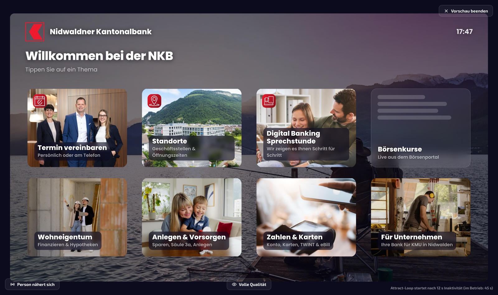
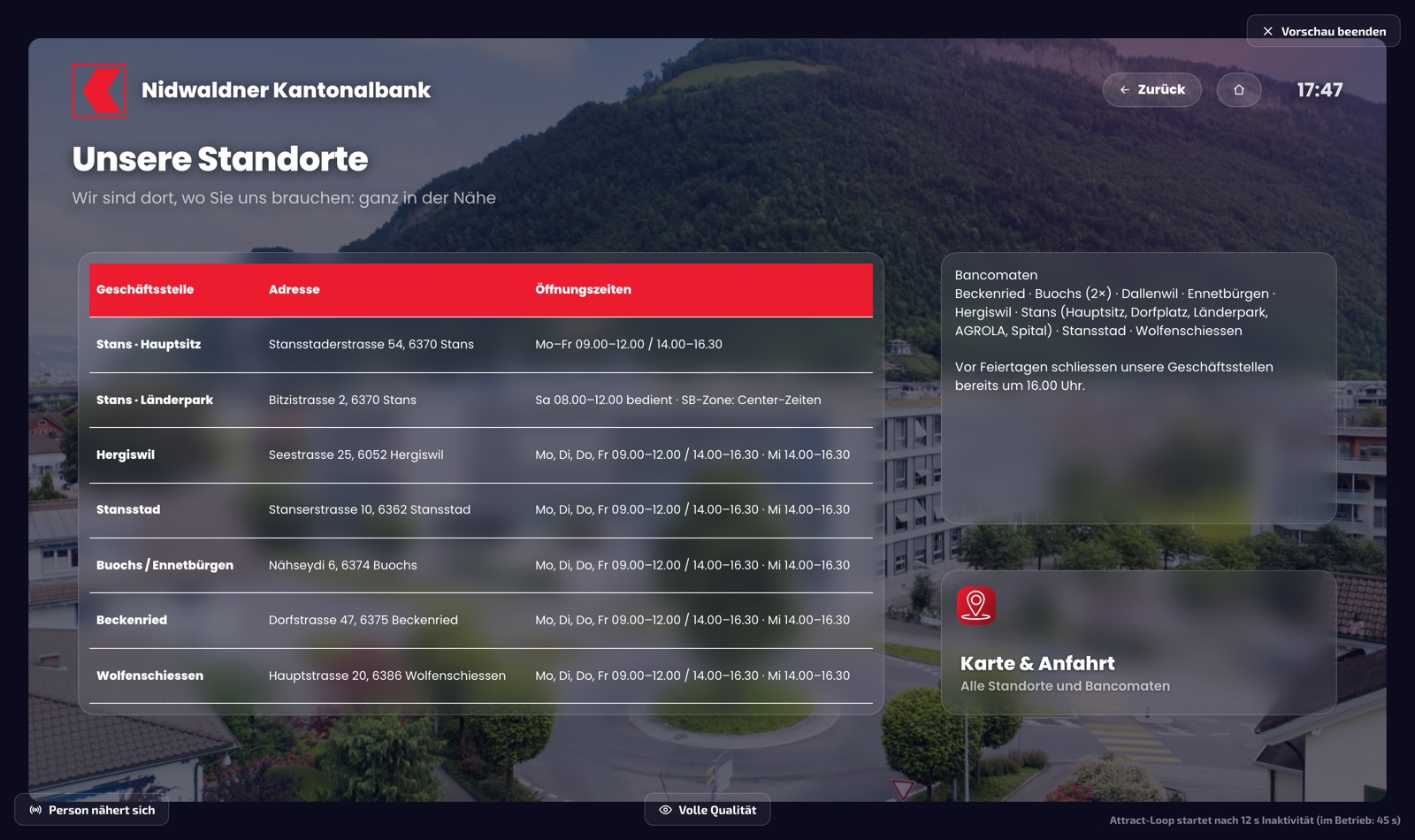
- Person approaching — simulates the motion sensor: a brief greeting, after which the player automatically jumps to the start layer.
- Quality level — cycles through four levels so you can see how your experience performs on weaker devices.
The four levels mean:
- Full quality — glass effect with blur and all loop videos.
- Without blur — glass without blur, videos keep playing.
- Without video — additionally, all loop videos off (background and tiles).
- Flat — no transparency and no animations.
The level is determined automatically on the device. Older signage displays (Tizen 4, webOS 4) start at "Without video" — so you won't see loop videos there. If the frame rate drops below 24 frames per second, the app automatically switches down a level. So test important experiences once at the "Without video" level.
Step 5 · Publish
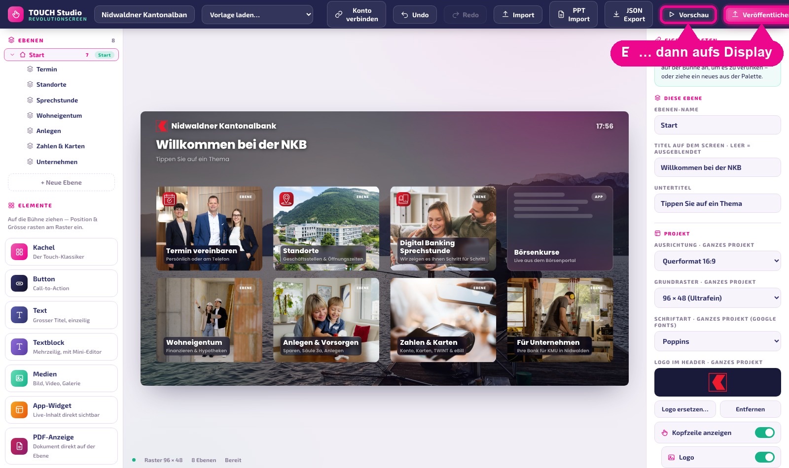
Once you're satisfied, click Publish at the top right.
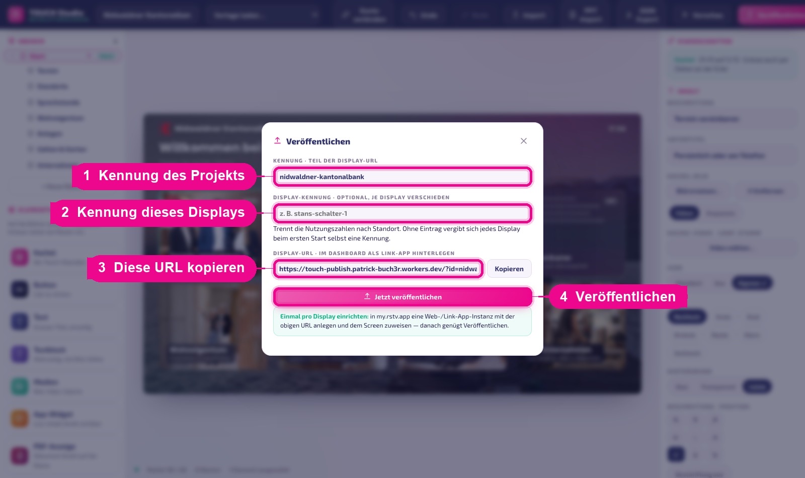
- Identifier — the name of your project in the display URL. Suggested from the project name; lowercase letters, numbers, and hyphens are allowed. It stays with the project, so you only need to set it once.
- Display identifier — optional, but recommended with multiple displays: a descriptive name like
stans-schalter-1. It later separates usage figures by location. - Display URL — enter exactly this address into the instance in my.rstv.app (see step 2). Copy puts it on the clipboard.
- Publish now — creates a new revision.
Every publish creates a new revision; you can see the last eight in the dialog. If something goes wrong, Roll back takes you to an earlier version in seconds — nothing is lost.
If the entered identifier already belongs to another project, the dialog warns you and the button then reads "<Projekt> überschreiben" (overwrite project). If you publish anyway, the other project's display will show your current experience from now on.
On the display
The display shows the experience in full screen. It fetches new versions automatically — within five minutes at the latest, or immediately via Neustart (restart) in my.rstv.app. If someone is currently using a sub-page, the app waits with the switch until the visitor is done.
- Offline — the last loaded version is stored on the device. If the network fails, the experience keeps running; there's no black screen.
- Motion sensor — a USB sensor on the display starts the experience as soon as someone stands in front of it.
- Portrait mode — works the same way; change the orientation in the project.
Never embed images as an external internet address (for example, directly from an image database). Ad blockers, corporate firewalls, and offline operation block such addresses — the tile then stays empty. Upload images in the Studio instead.
Multiple displays with the same experience
A project can run on any number of displays — you create one instance per display and enter the same display URL. So that you can still see which display was used in the reporting, attach your own display identifier per display:
- Display 1:
…/?id=empfang&screen=stans-schalter-1 - Display 2:
…/?id=empfang&screen=laenderpark
If you don't enter anything, each display assigns itself an identifier at first startup. The displays can then be distinguished, but they're named "gerät-a1b2c3" instead of "Länderpark".
Usage figures: what is actually being tapped?
In the publish dialog, Nutzung ansehen (view usage) leads to a report: which tile was pressed how often, when, and on which display.
- Day · month · year side by side, each with a comparison to the previous period.
- Two ring charts — by content type and by layer.
- Tiles by taps, history in days, weeks, or months, time of day, and the breakdown by display.
- CSV for Excel and PDF / print for the report to management.
Only tile, layer, timestamp, and display identifier are counted — no personal data, no cookies, no IP addresses. After the first tap, it takes up to 30 seconds for the figures to appear in the report.
Tips & troubleshooting
The display still shows the old version
Up to five minutes is normal. It's faster with Neustart (restart) in my.rstv.app. If someone is currently using the display, the app deliberately waits.
Tiles stay empty
Almost always a linked external image. Upload the image in the Studio instead of entering an external address.
Text in the image is hard to read
Increase the layer darkening or, for the tile, set the background to Leiste (bar) — then a band sits only behind the text.
Loop video does not play
Older signage displays turn off videos automatically. Check your experience in the preview using the Ohne Video (without video) level — it must work there too.
I don't see my apps to choose from
Click Konto verbinden (connect account) at the top and sign in with your my.rstv.app credentials. Without a connection, the studio only shows generic placeholders.
Accidentally deleted something
Ctrl/Cmd + Z undoes up to 60 steps. If it's already published, use Zurückrollen (roll back) to an earlier revision.
Outlook: Touch as its own app in the Appstore
Today, Touch is delivered via a web/link app instance — the approach described in this guide. It is proven and runs reliably.
A second approach is in preparation: Touch will then become its own app type in the Appstore. You install the app, create instances as usual, and assign them to a screen — entering the display URL will no longer be necessary. The technical groundwork for this is already in place; only one detail of the instance assignment on the platform side remains open. For you, this changes nothing about existing projects: the same experience runs either way.
Questions about Touch? Get in touch with us — we're happy to help you set up your first experience together.